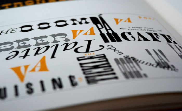
Nostalgic letterforms are surfacing on landing pages, mobile apps, and brand campaigns with surprising frequency. High-resolution displays now render ink-bleed quirks and handset irregularities that once belonged exclusively to print, allowing old-school aesthetics to meet contemporary usability.
Cultural curiosity arrives from many directions. Film title sequences reimagine 1960s serifs, independent magazines showcase wood-type slabs, and even network engineers benchmarking an israel proxy server will notice vintage glyphs in dashboard sidebars. The visual nod to past decades quietly signals authenticity while resisting the sameness produced by default web fonts.
The Emotional Pull of Pre-Digital Letterforms
Type crafted before desktop publishing carries a tactile origin story. Metal sorts pressed into paper left microscopic distortions impossible to fake convincingly with naive filters. When those shapes appear on a phone screen, an audience senses craft, patience, and narrative. Brand strategists report improved memorability when retro fonts headline product launches aimed at niche communities valuing heritage over hype.
Film directors, indie game studios, and craft-beer labels contribute momentum. Each sector treats typography as mood-setting rather than mere legibility. A slab serif from the American West conjures frontier grit, while a condensed sans from Inter-War Berlin suggests modernist confidence. These associations travel faster than explanatory copy, guiding interpretation within seconds.
Key Eras Powering the Comeback
- Victorian Flourish (1830-1900)
Ornate capitals and high-contrast strokes communicate luxury and theatrical energy. - Art Deco Geometry (1920-1940)
Bold lines and rhythmic symmetry evoke optimism linked with industrial progress. - Mid-Century Friendliness (1945-1965)
Rounded sans-serifs embody approachability, perfect for tech onboarding screens. - Psychedelic Experiment (1965-1975)
Fluid letterforms bring counterculture vibrancy to music or festival branding. - Early Digital Pixel Grid (1975-1985)
Blocky bitmaps trigger nostalgia for arcade cabinets and 8-bit consoles.
Each period provides ready-made emotional shorthand, reducing marketing overhead by letting viewers self-calibrate expectations.
Practical Reasons Behind the Revival
High-density displays exceed 400 pixels per inch on flagship phones, eliminating blur that once plagued small ornate glyphs. Variable-font technology packs multiple weights and optical sizes into a single file, trimming HTTP requests and simplifying responsive layouts. Licensing has also evolved; foundries reissue classics under web-app licenses that cover streaming services, kiosks, and smartwatch faces in one agreement.
Design systems embracing retro fonts often pair them with neutral companions. A geometric sans in body text balances an elaborate headline, ensuring readability for long-form content. Grid-based layouts keep nostalgia from sliding into chaos, while color palett
es drawn from aged posters—cream, muted teal, faded crimson—underline authenticity.
Balancing Style With Performance
Vintage fonts tend to include expansive glyph sets to support multilingual projects. File-size bloat threatens page-load metrics if unmanaged. Subsetting tools strip unused characters, and modern compression formats such as WOFF2 reduce transfer cost dramatically. Preload hints further improve perceived speed, guaranteeing a headline appears immediately rather than after layout shift.
Accessibility considerations remain vital. Decorative scripts may challenge vision-impaired users. Design teams apply generous line spacing, maintain at least 4.5:1 color contrast, and reserve ornate faces for short bursts. Screen-reader support improves when semantic tags describe headings accurately, letting assistive technology ignore stylistic complexity.
Tools That Bring Retro Fonts Into Today’s Workflow
- Variable-Font Editors
Enable real-time weight adjustments without multiple files, useful during rapid prototyping. - Subsetting Platforms
Remove unneeded glyphs to align with Core Web Vitals goals. - Automated Contrast Checkers
Verify WCAG compliance when vintage hues meet intricate outlines. - Browser DevTools Performance Audit
Spot render-blocking font calls early in development. - Content Delivery Networks With Edge Caching
Serve heavy font files from nearby nodes, minimizing latency for global audiences.
Integrating these utilities ensures style does not compromise speed or accessibility.
Forecast: Sustained Popularity, Evolving Application
The retro wave shows no sign of receding. As augmented-reality overlays and wearable interfaces mature, designers will search for warm human touches to offset sterile futurism. Vintage typography provides that warmth without sacrificing clarity when paired thoughtfully with modern grids and responsive logic.
Open-source communities continue to digitize century-old specimen books, broadening the palette available to independent creators. Artificial intelligence further accelerates revival by automating optical corrections while preserving lovely imperfections. Meanwhile, brand guidelines increasingly treat type choice as cultural storytelling rather than decorative afterthought.
Enthusiasts and professionals alike stand at a fertile intersection: endless archives of forgotten fonts meet unprecedented technical power. When nostalgia pairs with rigor—file optimization, accessibility checks, contextual color—digital products gain distinctive voices that resonate beyond algorithms and ad budgets. Expect login screens, smart-home dashboards, and even automotive heads-up displays to carry echoes of letterpress shops, reminding users that progress and tradition can share the same line without compromise.