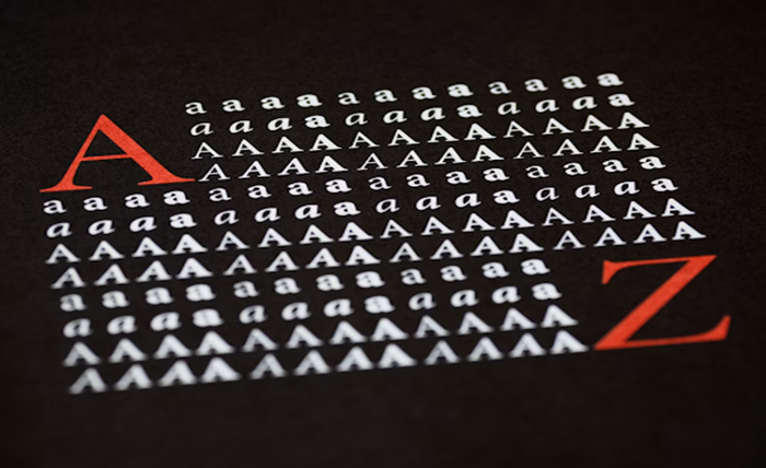
A decorative font is a soloist that carries attention and sets a mood. The body text is the ensemble behind it. Most layout problems stem from asking a display face to do the reading or a workhorse sans to carry the personality. Once you separate those two jobs, pairing becomes a set of small, testable decisions.
Designers who assemble product interfaces face the same puzzle, from a portfolio landing page to the header of a mobile game like fortune gems 2 online, where a heavy ornamental logotype sits above tiny status text, and both have to remain legible on a 5-inch screen. The principles below apply to blog posts, menus, invitations, and any layout where a decorative face meets running copy.
Reading the Job of Each Typeface Before Pairing
Every pairing starts with a role assignment. Decide which typeface is meant to be looked at and which is meant to be looked through. The first is the display face. The second is the body face.
Display Face Traits
Decorative fonts carry high-contrast strokes, unusual terminals, script flourishes, or heavy weight variation. These traits make a headline memorable at 48 pixels and unreadable at 14. Reserve them for words a reader will see for less than two seconds: titles, section openers, callouts, and short labels.
Body Face Traits
A dependable body face has even stroke weight, a generous x-height, open counters, and clearly distinguished characters (the lowercase “l”, the number “1”, and the capital “I” should never blur into one shape). Humanist sans-serifs like Source Sans, Inter, and Noto Sans read well on screens. Transitional serifs like Source Serif or Charter read well in print and long-form web.
Matching Mood Without Matching Shape
Good pairs share a mood but differ in structure. A hand-drawn brush script beside a geometric sans creates useful contrast, as both faces feel modern without competing. A pair that shares too much (two humanist sans-serifs of similar weight) reads as an accident.
The table below shows combinations that work often, combinations to test carefully, and combinations to avoid without a strong reason.
| Display Style | Safer Body Pair | Combinations to Avoid |
| Blackletter or gothic | Neutral humanist sans, medium weight | Any script or condensed serif |
| Script or brush | Geometric sans with clear counters | Italic serif, second script |
| Slab serif display | Transitional serif, or clean sans | Another slab of similar weight |
| Retro or novelty | Neutral grotesque sans | Any second decorative face |
The Numbers That Keep a Layout Readable
Pairing is not only about which fonts you choose. It is about the size relationships and spacing that let the reader move from headline to paragraph without friction. A decorative font at the wrong size will bully the copy underneath, no matter how thoughtful the pair is on paper.
- Size and scale: Use a modular scale rather than picking sizes by feel. A ratio between 1.25 and 1.5 between heading levels keeps hierarchy visible without shouting. If body copy sits at 16 pixels, an H2 in a decorative face usually lands between 28 and 36 pixels on the web and is larger in print.
- Spacing and line length: Line height for body copy sits between 1.4 and 1.6. Line length for comfortable reading falls between 50 and 75 characters. Decorative headlines often need extra letter spacing when set in all caps and slightly tighter spacing when set in a script.
A Short Checklist Before You Ship the Layout
Run this before publishing any page or print piece:
- Read the body copy at arm’s length. If the decorative face pulls your eye away mid-sentence, the display size is too large.
- Squint at the page. Hierarchy should remain visible when the letters blur.
- Check the numbers. Currency, dates, and phone numbers must stay legible.
- Test on the smallest screen your audience uses, not the biggest one on your desk.
For more details, the Google Fonts knowledge base on choosing typefaces collects practical guidance from working type designers.
Bringing the Pair Into a Working System
A pairing you like on a mood board still has to survive a real page with real content, including long author names and text in more than one script. Save your pair as a two-token system in your design file: one token for display and one for body, each with a weight range and a fallback stack. That way, a switch of decorative face later does not force a rewrite of every heading.