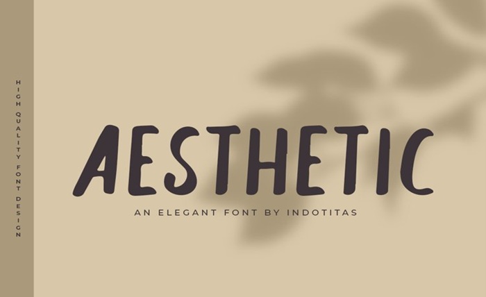
Have you ever noticed how a simple word written in “normal” letters can go completely unnoticed… while the same word in a retro, minimalist, or “Pinterest girl” font suddenly makes you want to click? That’s not magic. It’s visual psychology. And today, content creators know it very well.
On TikTok, Instagram, or YouTube Shorts, the battle sometimes doesn’t even last three seconds. Users scroll like human slot machines. So every detail matters. Color. Rhythm. And above all… typography.
For a long time, fonts were seen as simple decoration. Like choosing wrapping paper for a gift. Now? They’ve become the gift itself.
A study published in Font Matters: Deciphering the Impact of Font Types on Reading Performance shows that font choice directly influences attention, comprehension, and memory. Some typefaces create smoother reading, while others trigger immediate emotion or curiosity.
And in a world where human attention resembles a hyperconnected goldfish… that’s a powerful weapon.
The brain loves anything that breaks the routine
The problem with “standard” text is that it becomes invisible. The brain loves saving energy. It automatically filters what it considers ordinary.
But an original font acts like a small cognitive alarm.
Boom.
Something stands out.
Creators use aesthetic fonts to interrupt automatic scrolling. It’s the same principle as exaggerated YouTube thumbnails or red notification badges on apps.
A recent study on Gen Z’s digital behavior explains that typography now plays a cultural and emotional role in social content. Fonts are no longer just for reading. They convey a mood, an identity, almost a personality.
That’s why a sentence written in a typewriter-style font instantly feels like a “mysterious diary.” A minimalist font suggests luxury. A bold, colorful typeface brings back early-2000s nostalgia.
Text becomes a visual emotion.
TikTok turned letters into a marketing strategy
Take TikTok. The platform works like a cognitive casino. Every swipe promises a new surprise. And according to recent stats, users sometimes give less than 8 seconds of attention before deciding whether to stay… or leave.
Result: creators must capture the eye instantly.
That’s where aesthetic fonts explode.
Lifestyle influencers use handwritten fonts to create emotional closeness. Tech brands choose ultra-clean typography to appear futuristic. Comedy accounts prefer absurd or intentionally “cheap” lettering because it triggers an instant laugh.
Even Netflix plays with this. Look at the difference between Stranger Things and Bridgerton posters. Before you even read the title, the typography already tells a story.
And it works.
Research on digital readability shows that certain combinations of fonts and spacing improve reading speed and memory on screens. In other words: good typography can literally keep someone looking at a screen longer.
Yes. Letters manipulate time.
Even betting platforms understand the power of fonts
In the world of digital entertainment, this visual battle is everywhere. Online gaming and betting platforms have fully embraced it. Take TonyBet, for example, known in the “online sportsbook” space. Its visual identity relies heavily on strong contrasts, bold typography, and highly readable mobile elements. That’s no coincidence. In an ultra-competitive environment, an interface that captures attention instantly can make the difference between a user who stays… and one who disappears after two seconds.
And honestly, the phenomenon goes far beyond betting. Platforms like Spotify, Duolingo, Airbnb, and Notion all use carefully designed typography to create a specific feeling for users.
Because today, reading is not enough.
You have to feel.
The future of content will be visual… even in text
The irony? We probably read more than ever. Messages, captions, notifications, comments, newsletters, subtitled reels… text is everywhere.
But our brain doesn’t read like it used to.
It scans.
It skips.
It samples.
Creators who understand this adapt the way they write. They turn words into visual objects. Fonts become rhythm tools, almost like a silent soundtrack.
And this isn’t just for professional designers anymore. Today, platforms like Font Copy Paste allow anyone to transform plain text into something far more eye-catching in seconds.
It’s the new makeup of the web.
Of course, a beautiful font will never fix a bad idea. But in today’s attention economy, it can offer that crucial micro-moment: the one where someone decides not to scroll away.
And sometimes, on the internet, half a second is worth gold.