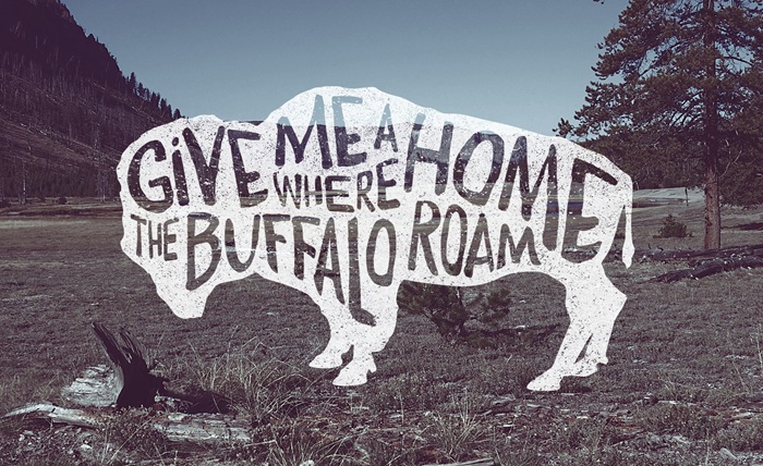
In graphic design, Helvetica reigns supreme as the most popular font in the world. Its clean design makes it a perfect pick for corporate branding and signs, but it’s far from the only font out there. After all, there are countless options you can use to make your social media bio pop or give your digital project a distinct personality. That’s the beauty of typography: it goes beyond just making words readable and lets them carry a certain emotional experience.
Take something casual like online gaming, for example. The text you see on screen doesn’t just relay information, but provides a certain experience. After all, you won’t use the same font in a casual mobile puzzle as you would in a high-stakes online poker game. The text on screen carries a certain expectation, which affects how you feel about the game and the platform as a whole.
The Psychology Behind the Script
Designing a game is a process that’s all about the little details. These are things the players will not notice if they’re done well, but it’ll be an instant mood killer otherwise. Imagine playing a serious sci-fi game, but all the menus are written in Comic Sans. Precisely. It would instantly take you out of the experience, even if everything else was perfect. It’s a similar story for online card games, where you expect the visual aesthetic to match the mood.
This is why premium digital experiences lean on sleek, authoritative fonts. Enthusiasts seeking to try their luck and play black jack want something that looks good and is easy to read. After all, players need to be able to tell individual card values at a glance, along with hand totals, their current balance, and more. On top of that, the font has to look good on vastly different screens. Whether it’s a smartphone screen or a huge 4K desktop monitor, the typography has to stay consistently high quality.
Building Trust Through Clean Design
Any digital space where players gather to compete and play requires lots of visual polish. Websites that have an inconsistent style and messy alignments risk coming across as untrustworthy and insecure. This is especially a problem for gaming websites, where players are naturally on guard against untrustworthy operators.
By following a typographic hierarchy, gaming developers avoid this problem and naturally guide the player’s eye:
- Primary headings are usually stylized and use custom fonts to capture a game’s unique theme and setting.
- Action buttons like Join Table, Spin, or Deal use high-contrast, bold typography that tells the player what to do next.
- Data and UI text are neutral and highly legible. It’s there to inform the player rather than guide them to do something, making it perfect for presenting chat logs, odds, and more.
Learn From the Best
You don’t have to be a professional UI designer to take advantage of typography. There are countless examples online from online game developers on how they set the mood with font choice and button placement. Fontcopypaste makes it easy to experiment with different typefaces, allowing you to make your future display name, website, or social media profile just right.